> ## Documentation Index
> Fetch the complete documentation index at: https://cubed3-feat-druid-driver-streaming.mintlify.site/llms.txt
> Use this file to discover all available pages before exploring further.
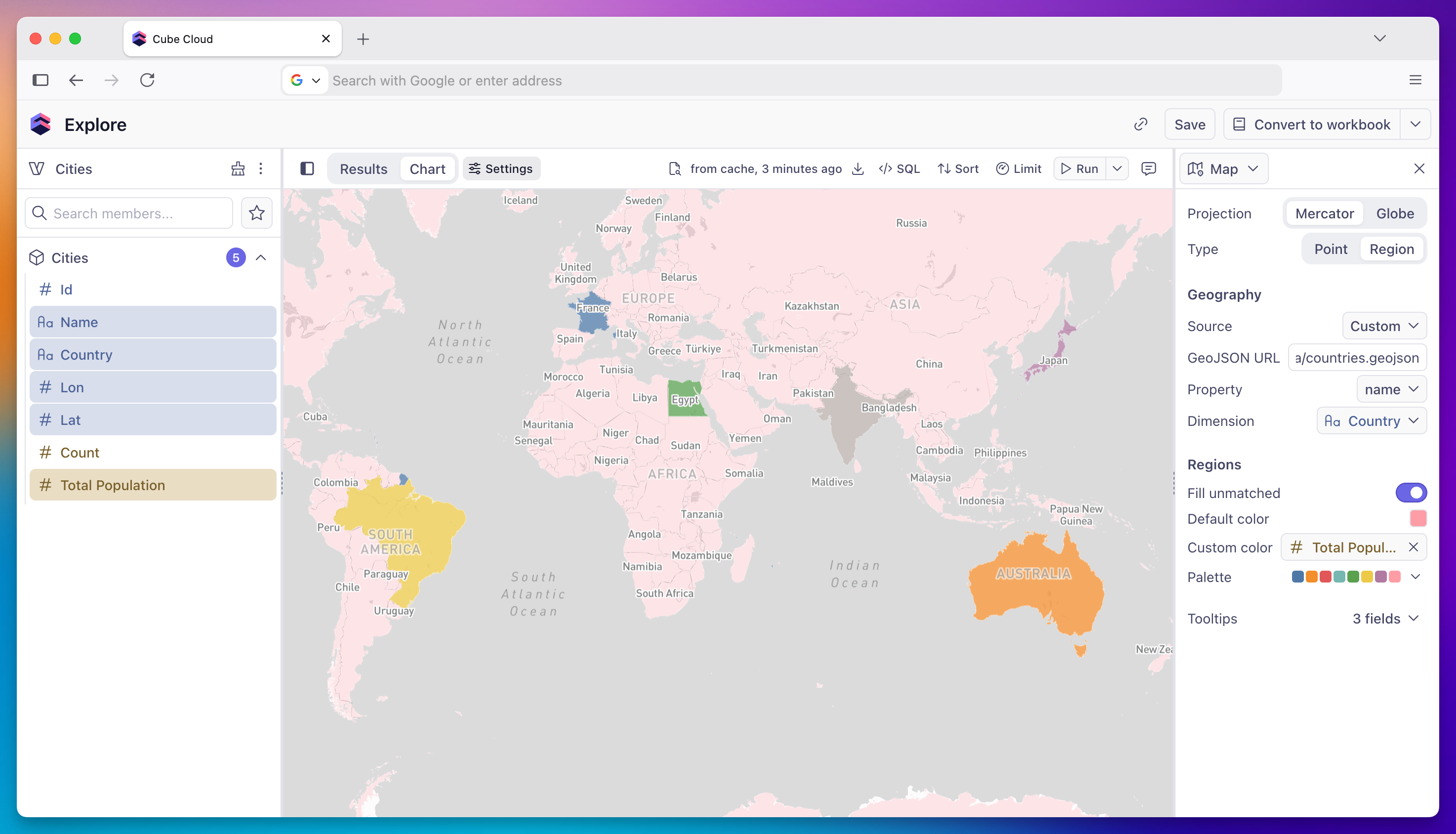
# Map
> Plot geographic data as point maps (latitude/longitude) or region maps (choropleth from GeoJSON polygons).
Map charts visualize geographic data in two modes:
* **Point map** — plot rows at their latitude/longitude coordinates, optionally sized and colored by additional fields.
* **Region map** — paint polygons (countries, US states, or any custom [GeoJSON](https://en.wikipedia.org/wiki/GeoJSON)) as a choropleth driven by a measure.
 ## When to use
* **Point map** — locations with known coordinates (stores, shipments, sign-ups), geographic clusters and outliers.
* **Region map** — measures aggregated by country, state, postcode, sales territory, or any user-defined polygon set.
## Chart type
Pick **Point** or **Region** in the chart settings panel's **Type** row. The default is **Point**.
## Projection
| Projection | Description |
| ----------------- | ------------------------------------------------------------------- |
| **Mercator (2D)** | Standard flat map projection — best for most use cases |
| **Globe (3D)** | Spherical globe view — useful for data spanning multiple continents |
Both modes support either projection.
## Point map
A point map requires:
* **Latitude** — numeric field containing decimal latitude.
* **Longitude** — numeric field containing decimal longitude.
Optional:
* **Size** — numeric measure that scales point radius proportionally.
* **Color** — dimension or measure that colors points by category or value.
### Point color
When no **Color** field is assigned, all points render in the configurable **Default color**. When a dimension is assigned, each unique value gets a distinct color from the active palette — pick from the built-in palettes or supply a custom one, see [Color and stacking](/docs/explore-analyze/charts/configuration/color-and-stacking).
### Point size
Assign a numeric measure to the **Size** channel to scale point radius by value. The size range (minimum and maximum radius in pixels) is configurable in the settings panel.
### Clustering
Clustering groups nearby points into a single circle that expands on zoom. It is **off by default** and can be enabled in the settings panel.
## Region map
A region map requires:
* **Source** — the GeoJSON to render: `World countries`, `US states`, or `Custom`.
* **Property** — which property in each GeoJSON feature acts as the join key (e.g. `name`, `ISO3166-1-Alpha-2`, `state_code`).
* **Dimension** — which column from your query joins to **Property**.
* **Measure** — the numeric measure that drives the choropleth fill.
Built-in sources expose a fixed list of allowed properties. **Custom** lets you point at any public GeoJSON URL; the property dropdown then enumerates every key present in the feature collection.
When the chart enters Region mode, the join dimension and measure are auto-picked when an unambiguous match exists in your query.
The choropleth gradient comes from the active palette — pick from the built-in palettes or supply a custom one, see [Color and stacking](/docs/explore-analyze/charts/configuration/color-and-stacking).
### Custom GeoJSON
When **Source** is set to **Custom**, paste a URL serving a GeoJSON `FeatureCollection`. Requirements:
* Served over HTTPS with CORS enabled.
* Polygons or multipolygons (not points or lines).
* Each feature must have a `properties` object containing the join key.
The fetched GeoJSON is cached for the session.
### Unmatched regions
Regions in the GeoJSON with no matching data row are hidden by default. Toggle **Fill unmatched** in the settings panel to render them with the **Default color** at reduced opacity instead.
## Tooltip fields
The **Tooltips** section controls which fields appear when a user hovers over a point or region. See [Tooltips](/docs/explore-analyze/charts/configuration/tooltips).
## Map interaction
The map is interactive — users can pan and zoom. Viewport changes persist while you edit other settings; switching the data source or projection re-fits the camera to the new bounds.
## When to use
* **Point map** — locations with known coordinates (stores, shipments, sign-ups), geographic clusters and outliers.
* **Region map** — measures aggregated by country, state, postcode, sales territory, or any user-defined polygon set.
## Chart type
Pick **Point** or **Region** in the chart settings panel's **Type** row. The default is **Point**.
## Projection
| Projection | Description |
| ----------------- | ------------------------------------------------------------------- |
| **Mercator (2D)** | Standard flat map projection — best for most use cases |
| **Globe (3D)** | Spherical globe view — useful for data spanning multiple continents |
Both modes support either projection.
## Point map
A point map requires:
* **Latitude** — numeric field containing decimal latitude.
* **Longitude** — numeric field containing decimal longitude.
Optional:
* **Size** — numeric measure that scales point radius proportionally.
* **Color** — dimension or measure that colors points by category or value.
### Point color
When no **Color** field is assigned, all points render in the configurable **Default color**. When a dimension is assigned, each unique value gets a distinct color from the active palette — pick from the built-in palettes or supply a custom one, see [Color and stacking](/docs/explore-analyze/charts/configuration/color-and-stacking).
### Point size
Assign a numeric measure to the **Size** channel to scale point radius by value. The size range (minimum and maximum radius in pixels) is configurable in the settings panel.
### Clustering
Clustering groups nearby points into a single circle that expands on zoom. It is **off by default** and can be enabled in the settings panel.
## Region map
A region map requires:
* **Source** — the GeoJSON to render: `World countries`, `US states`, or `Custom`.
* **Property** — which property in each GeoJSON feature acts as the join key (e.g. `name`, `ISO3166-1-Alpha-2`, `state_code`).
* **Dimension** — which column from your query joins to **Property**.
* **Measure** — the numeric measure that drives the choropleth fill.
Built-in sources expose a fixed list of allowed properties. **Custom** lets you point at any public GeoJSON URL; the property dropdown then enumerates every key present in the feature collection.
When the chart enters Region mode, the join dimension and measure are auto-picked when an unambiguous match exists in your query.
The choropleth gradient comes from the active palette — pick from the built-in palettes or supply a custom one, see [Color and stacking](/docs/explore-analyze/charts/configuration/color-and-stacking).
### Custom GeoJSON
When **Source** is set to **Custom**, paste a URL serving a GeoJSON `FeatureCollection`. Requirements:
* Served over HTTPS with CORS enabled.
* Polygons or multipolygons (not points or lines).
* Each feature must have a `properties` object containing the join key.
The fetched GeoJSON is cached for the session.
### Unmatched regions
Regions in the GeoJSON with no matching data row are hidden by default. Toggle **Fill unmatched** in the settings panel to render them with the **Default color** at reduced opacity instead.
## Tooltip fields
The **Tooltips** section controls which fields appear when a user hovers over a point or region. See [Tooltips](/docs/explore-analyze/charts/configuration/tooltips).
## Map interaction
The map is interactive — users can pan and zoom. Viewport changes persist while you edit other settings; switching the data source or projection re-fits the camera to the new bounds.